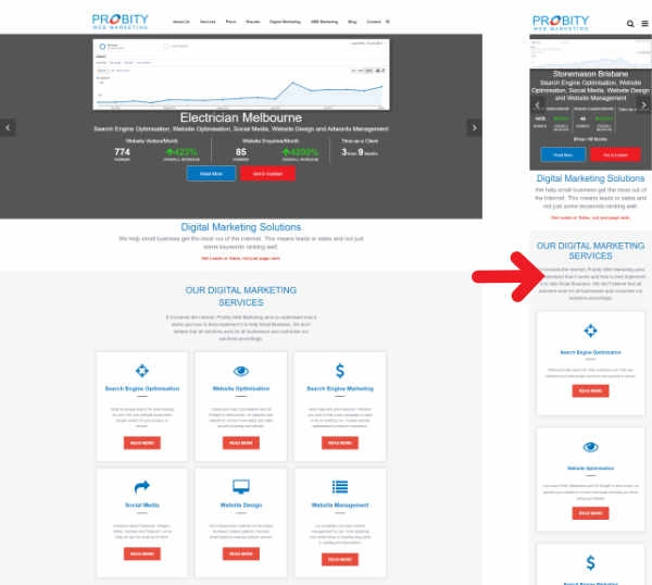
Need a Mobile Website Design?
Is your website mobile friendly? If NO, then you really don't have a website capable of delivering effectively for your business. Maybe back when you had your website designed it worked, but not today. Over 50% of search is now on mobile phones, so if your website is hard to read and navigate on a mobile phone your visitors will just leave. Of course, that's if they find your website in the first place. With the growth in mobile search, Google now ranks your website depending on how it looks and reads on a mobile phone ("Mobile First").
A brief history of Mobile Website Design
When websites first became a thing, we all searched and looked at them with desktop computers. Not only that, but in most cases, we all had similar sized monitors; or as we call them now, screens. So web design was pretty straight forward; just design a website that looks good and works well on an the common sized screen. However, with the growth in smartphones, more and more people started using them to search and view websites with. Suddenly we were looking at websites designed for a larger screen on a small phone screen. Not only do they look wrong, they are horrible to use. So web design companies started looking at ways to make a website look good on a larger desktop computer as well as on the smaller mobile screen.
Mobile Only Websites
The first strategy was to create a second website designed for mobiles. In most cases, this was a smaller website than the desktop version, with just a few of the main pages. It was widely thought that people didn't want to look at a full website on a mobile phone, which we now realise isn't the case. It also meant that if you had to change something (eg. price etc), then you had to do it on both websites.
Website with multiple design templates
Not only did we realise that people wanted to view a full website on a mobile, but we also started getting tablets. Suddenly, the 2 website strategy wasn't a viable option. So we started developing 3 different web design templates for the same website; mobile, tablet and desktop. Then whe someone viewed the website, it would work out what device they were on and deliver the website wrapped in the appropriate web design template. This seemed like the perfect solution; everyone got to see the same website and it was designed to look and work for the relevant device. However, then we started to get mobile phones, tablets and even desktop screens coming in wide range of different sizes. What may look and work great on a 10inch smartphone doesn't work so well on a 7inch phone.
This lead us onto Responsive Website Design .
What is Responsive Web Design?
Responsive Website Design is where we build a website to respond to whatever size screen you are viewing it on. If done correctly, no matter what size screen you're viewing the website on, it should look and work exactly how it's meant to.

Reasons for Responsive Website Design
Let's recap on why you should have a responsive website.
- Over 50% of all search is now done on smartphones. So if your website doesn't look good or work on a mobile phone, you're alienating over half the people coming to see your website.
- Google understands the importance of mobile and has recently moved from ranking the desktop version of your website and using these ranks for mobile search to the reverse: ranking your mobile version and using these ranks on desktop searches. So if your website doesn't work very well on mobile, how do you expect it to rank well.
- Google Recommneds it! Considering that Google accounts for pretty much all of the search in Australia, if they give us advice we would be silly not to take it onboard.
- As part of the design process, we consider the best way to display the same web page on smaller screens to ensure they are easy to read and navigate to. This includes things like larger fonts and buttons.
- It doesn't matter the size of your mobile device, the website will respond to suit it. No more having to decide how many different size phones you should be designing for.
- You are essentially showing your entire site on mobile devices, so if a website visitor wants to see more they can. No more frustration with a limited version of your website.
So if you're serious about getting the most out of your website then it has to be mobile-friendly. And the best way to make your website mobile-friendly is with responsive web design.
Get a Responsive Website
At Probity Web Marketing, we can develop a responsive website design to suit all your business needs. Check out our simple pricing structure.