Published: January 22, 2015 Last Updated: February 09, 2022
Website Optimisation With Heatmaps
Web Marketing is more than just setting up a few Adwords or posting a few posts to Facebook etc. To do it properly you need to not only look at how to increase traffic to your website, but what happens when someone gets to your website. There is no point in working hard (not to mention spend money) to generate traffic to your website if that traffic then either leaves your site or fails to convert to a lead or sale. This is where website optimisation comes in.
The overall goal of website optimisation is to improve our goal conversions. In most cases a goal conversion will be either a webform filled in or an online purchase and in some cases we can even track phone calls. One of the ways we improve this is with the use of Heatmaps.
What is a Heatmap?
A heatmap is a software program that will track where website visitors click on your website and then show this using colours to signify where the most clicks are. It is a very easy way to quickly see if your website design and layout is encouraging your visitors to do what you want. If not, then you can make changes and see the impact.
So let's look at some examples and how we use them to improve the website user experience (UX)!

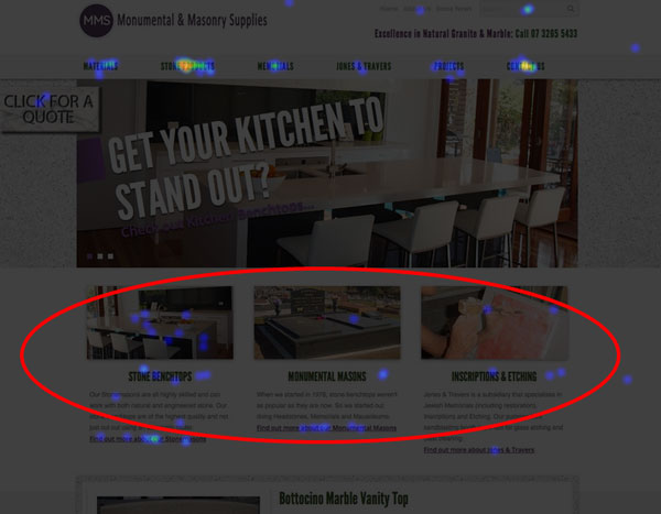
This heatmap shows the main service boxes on one of our client sites is confusing to visitors. We have a lot of clicks on the images and headings, but these aren't links. To get to the service page you need to click on the "Find out more..." link. Don't you think this could be frustrating for all those visitors that click on the wrong part? So we now need to tweak this website so that both the images and headings are linked.

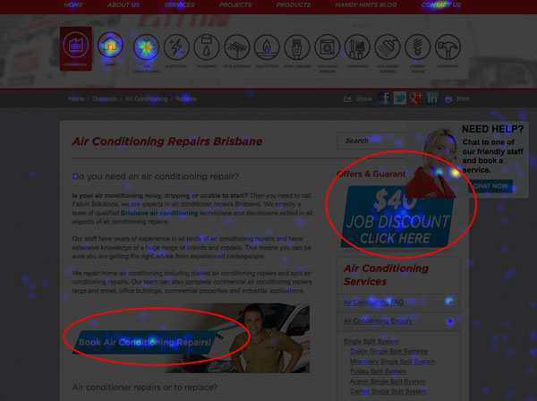
This client site uses what we call "Call to Action" boxes in the main text area that are aimed at getting the website visitor to fill in a booking webform. We also have a rotating section to display different "Offers and Guarantees" to help convert the visitor as well. As we can see from the above heatmap, these are both working well and are getting a high number of clicks.
Do rotating banners work on your website home page?

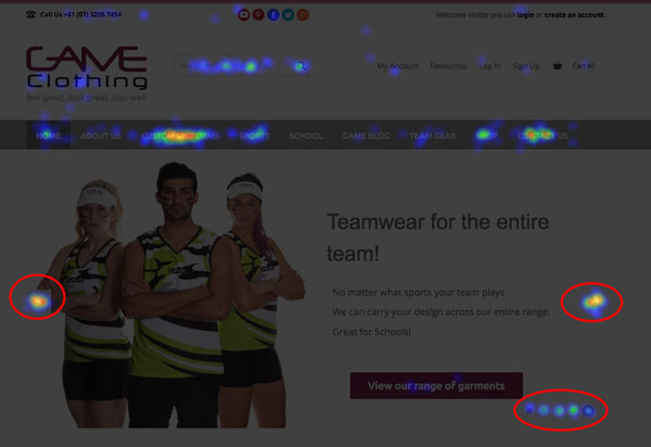
This heatmap shows really strong engagement with the rotating banner on this client site. As we can see, there are lots of clicks on both the forwards and backwards buttons as well as the indexing buttons. Not to mention some clicks on the call to action button. Overall this banner is doing a great job.

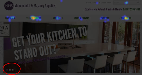
However, this heatmap shows that website visitors have no engagement with this banner. Before we decide to get rid of it though, we need to try and work out why this might be. Is it because our website visitors have no interest in the banner or is it because it isn't obvious that they can interact with the banner? Would it work better if the text link on the banner was converted to look like a button. We could trial a different layout and maybe run a split test (that's another article) to test it before we decide to remove it completely.
So there you have it. How a heatmap helps us to see how website visitors interact with our websites and how we can improve it.
If you'd like to know more about website optimisation give us a call or fill in a webform.

